UI
Introduction
8th Wall Studio offers a built-in UI system for creating interactive, user-friendly interfaces within your experience. The UI component provides a variety of building blocks with configurable properties ranging from text and images to flexible layout and customizable styling.
Adding UI Elements
You can introduce UI elements through several methods:
- New Primitive: Use the (+) option in the Hierarchy to add presets.
- Add Component: Attach UI elements on an existing entity.
- Scripting: Programmatically add elements using the API.
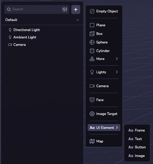
The (+) menu options are all presets of the same UI component, and can all be configured the same using the UI inspector.
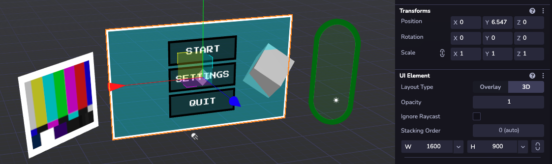
3D UI
3D UI elements integrate seamlessly into your 3D scene, allowing for spatially interactive displays. They can be positioned in the world with the transform inspector and require a width and height in world pixels (1/100th of a world unit), e.g. '500'. A child UI element's position is entirely determined by layout properties on it and its parent.
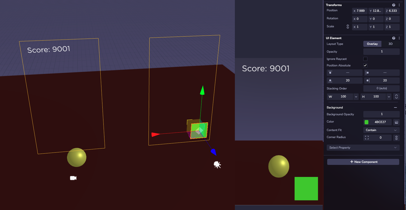
Overlay UI
For screen-anchored UI, overlay elements offer fixed positioning on top of the canvas. Size and positioning can be specified in display pixels (e.g. '125') or percentages (e.g. '30%'). The transfrom of top-level overlay UI elements is purely for organization in the viewport; their position on-screen is controlled with position: 'absolute'. Like with 3D, child elements are positioned relative to their parent.
Properties
The UI component comes with many configurable properties. In the viewport inspector, they are grouped by category and are not always visible. To add a section, click the 'Select Property' dropdown at the bottom of the configurator. For the full list of individual properties that can be specified at runtime in code, see the Ui API Documentation.
Layout
Use the layout configurator to control how child elements are positioned. The various alignment properties allow for dynamic menus that can handle changing content and screen size. The order in which children will appear is determined by their order in the hierarchy. UI children that are set to 'Position Absolute' will be fixed relative to the parent, ignoring its layout configuration.

Text
Text can be added to any UI element. The text section allows you to configure the content, font, size, color, and alignment. Text that exceeds the width of the element will automatically wrap to a new line.

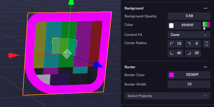
Background & Border
The visual style of a UI element is controlled by the Background section and Border section. Here, colors and transparency can be configured, and an image can be applied from a web URL or project assets.
Interaction
You can create functional buttons using a custom component with an event listener. UI elements support click/tap events as well as hover states. See the Input Events API Documentation for a comprehensive list of supported events and example code. These work with overlay and 3D UI elements.
A click will only fire on the top-most element at the pointer location. Layering is controlled by hierarchy order, with later siblings appearing on top of earlier ones. For precise control, use the 'Stacking Order' option at the top of the configurator to arrange groups of UI elements in a custom order.
Enable the 'Ignore Raycast' property on decorative, invisible, or full-screen layout-only frames to prevent them from blocking user input from reaching interactable elements that may lie underneath.

Fonts
Default Fonts
A selection of built-in fonts are available for use in any 8th Wall project.
Nunito
Akidenz Grotesk
Baskerville
Futura

Gotham
Helvetica
Nanum Pen Script
Press Start 2P
Times
Inconsolata
Custom Fonts
You can also upload custom fonts via TTF files to use in your UI Elements. Upload font files to your assets to make them automatically available for any UI in your project.